 +61 420 222 417
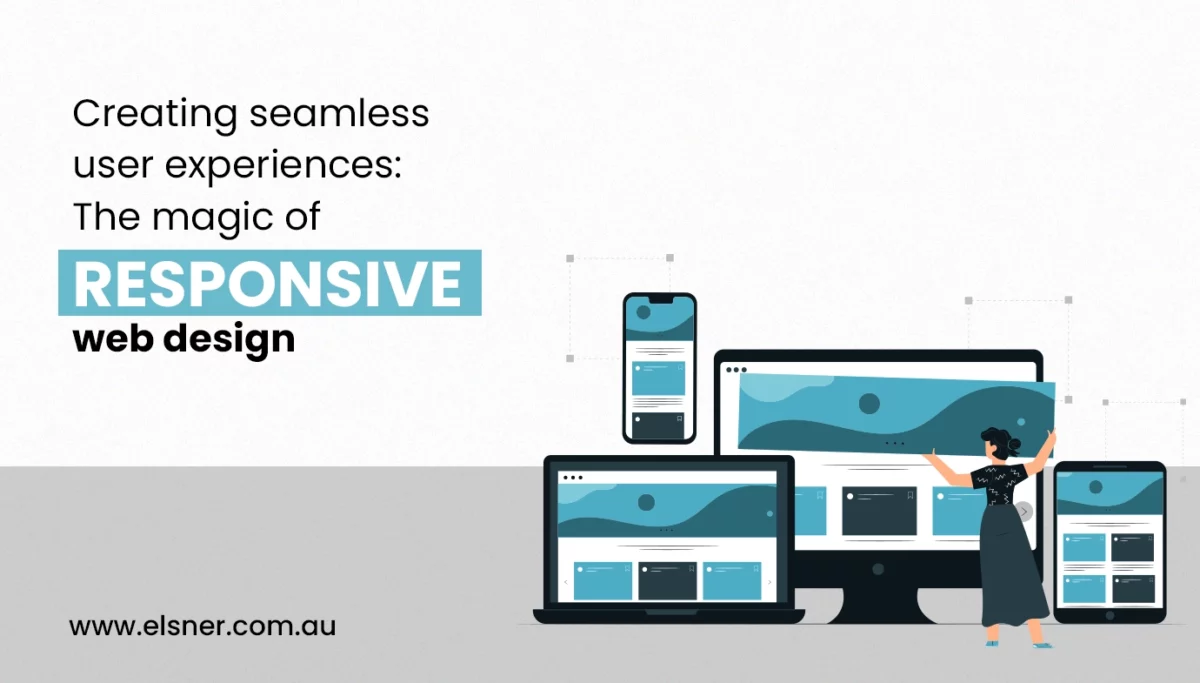
Creating Seamless User Experiences: The Magic of Responsive Web Design
Web DesignAre you aware of the biggest reason behind a lot of visitors leaving a website? Well, it is because of a non-responsive design. About 73.1 percent of web designers admit this. So, it is high time for all website owners to focus on responsive design if they do not want to lose their prospective visitors. If you aim to come up with a responsive website, then a reputed web development company in Melbourne can offer you related aid.
But, before you seek their assistance, it is suggested that you go through this comprehensive blog post from the start to the end. Here, we will focus on discussing responsive web design in detail, along with its key principles and techniques. We will also look at the significant benefits one can reap from responsive web design. So, let’s find out:
What is Responsive Web Design?
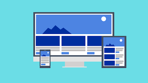
Responsive web design is known to be a web development approach that focuses on offering an optimal viewing and interaction experience across a diverse range of devices and screen sizes.
The main goal of responsive design is to make sure that websites seamlessly adapt to the different dimensions of devices, irrespective of whether it is a laptop, desktop, smartphone or tablet. If you are planning to make your website responsive, then it is a good idea to choose a professional web development company in Melbourne who possesses related experience.
Fundamental Principles and Techniques Involved in Responsive Web Design
Before you hire a web design company Melbourne, you should first get a good understanding of the main principles and the techniques involved in responsive web design. These are as follows:
- Fluid Grids: Responsive designs typically use relative units like percentages instead of leveraging fixed pixel values for layout elements. As a result, the layout can proportionally adapt to the size of the screen.
- Flexible Images: In the case of responsive design, images are also sized in relative units. So, it ensures proportional resizing of the images, preventing them from overflowing or breaking the layout, especially on smaller screens.
- Media Queries: Media queries generally refer to CSS techniques that enable the application of distinct styles on the basis of device characteristics. It includes screen height, width or orientation. Thus, it lets developers come up with rules that specifically target different sizes of screens or devices.
The main idea behind crafting a single version of a site is to offer an optimal user experience irrespective of the device being employed.
What are the Key Benefits of Responsive Web Design?

Responsive web design is more than just a design trend. It is considered to be a strategic approach that is known for offering multiple benefits. Some of the major ones include the following:
-
Improved User Engagement
Whenever you focus on responsive design, you can ensure that the users receive an enjoyable and consistent experience whether they access a website on a smartphone, tablet or desktop. This consistency helps foster higher engagement levels as users can navigate through the content seamlessly without encountering any usability concerns.
By improving the user experience of your website, you can again make sure that users spend more time on your website, which, in turn, increases the chance of conversion. To ensure that you have a responsive design, you can opt for the assistance of a professional web development company in Melbourne.
-
Broader Device Compatibility
In the present times, it has become imperative to ensure compatibility. This is mainly due to the availability of a range of devices, including compact smartphones, large desktop monitors, etc. The best thing about responsive web design is that it effectively caters to this diversity. So, it allows websites to function seamlessly on devices of almost all sizes.
Again, this broad compatibility helps expand the audience reach and also addresses the different preferences of users. If you need any assistance in developing a responsive website design, all you need is to reach out to a reputed Melbourne web design company.
-
Improved SEO Performance
Search engines, especially Google, put the utmost emphasis on mobile-friendly websites in their rankings. So, if you want to ensure that your site appears at the top of search results, then it becomes essential for you to focus on responsive design. A trusted web design company Melbourne can assist you in this aspect.
With a responsive design, you can ensure that your site is perfectly optimized for mobile devices, contributing to better search engine rankings. Improved SEO performance again results in a boost in organic traffic and visibility, which ensures the success of your business. In case you have a Magento website, you can hire Magento developers to receive related aid.
-
Cost-Efficiency
It can be resource-intensive to maintain separate versions of a website for distinct devices. But, whenever you have a responsive WordPress website design, you will not likely deal with this concern.
Responsive web design helps streamline the development process by creating a single website version that adapts to multiple devices. This particular approach helps in effectively reducing the cost of development. It also simplifies ongoing maintenance as updates need to be applied to a unified codebase.
-
Analytics and Tracking Simplification
Another best part about responsive designs is that they facilitate unified data tracking. Businesses can consolidate data from users across all devices instead of managing separate analytics for different versions of a website.
Thus, it helps them gain in-depth insights into user behaviour, interactions, and preferences, which informs strategic decisions for constant improvement. To learn more about this, you can contact a recognized web development company in Melbourne who can assist you in the best possible manner.
-
Faster Loading Times
Responsive designs are perfectly optimized for performance, resulting in swifter loading times. Quick page loads play a crucial role in ensuring user satisfaction. Reduced loading times again contribute to a positive user experience. Not only that, it also results in lower bounce rates and a boost in search engine rankings.
So, if you still do not have a mobile responsive website, it is suggested to opt for the assistance of a reputed web development company in Melbourne.
-
Adaptation to Changing Technology
Technology is evolving at a rapid pace, and a responsive design has the ability to adapt quickly to these shifts. Whether it is the advancements in browsing technologies or the introduction of new devices, responsive sites can easily adjust without necessitating significant redesigns.
Due to this adaptability, you can ensure that your website always remains functional and relevant with the continuous evolution of technology. It is suggested that you get in touch with a professional Melbourne web design company to come up with the most suitable design for your website.
-
Increased Flexibility for Content Management
By focusing on responsive designs, you can get increased flexibility, especially in content management. It ensures seamless execution of content updates, additions or modifications across all devices.
Thus, users can access the most updated information irrespective of the device they use. This flexibility can prove to be incredibly helpful for business owners who are looking for efficient content management solutions. If you have a Magento site, you can get further details by approaching professional Magento developers with related expertise.
Significant Components of Responsive Design
Responsive web design is known to be a nuanced approach that entails many important components working collaboratively to craft a user-friendly and flexible digital experience. Now, let’s have a quick look at some of the important ones before you reach out to a reliable web development company in Melbourne:
-
Mobile-First Approach
It is one of the significant shifts in design philosophy. With the prevalence of mobile device usage, designers are currently focused on crafting the mobile version of a site before focusing on larger screens.
So, this particular approach helps in ensuring that the core functionality and content of the website are optimized for smaller screens. Thus, it offers a solid foundation for a smooth user experience across all devices. Reaching out to a Melbourne web design company will let you know more about this.
-
Breakpoints and Layouts
Some of the critical components of responsive web design include breakpoints and layouts. These generally allow designers to define how a particular website should adapt to various screen sizes.
Breakpoints refer to specific points at which the layout of a webpage is accustomed to accommodate the device’s characteristics. Designers are focused on placing breakpoints strategically, which ensures a smooth transition in layout. Thereby, it helps in optimizing the user experience for different screen dimensions.
-
Adaptive Images
Whenever it comes to user engagement, images tend to play a pivotal role. The designing of adaptive images is done in a manner that makes sure that the visuals remain impactful across various devices. The best part about adaptive images is that they dynamically adjust in resolution and size depending on the user’s screen. Thus, it prevents specific concerns like slow loading times or images hampering or breaking the layout on smaller screens.
If you need assistance in coming up with a responsive WordPress website design, you can hire Magento developers.
Wrapping Up
Thus, responsive web design is not just a trend but has become a necessity in the present times, with more and more people relying on mobile devices in the present times. If you are ready to get started with the responsive web design journey, partnering with a reputable web design company Melbourne is a good idea. With this, you can unlock the full potential of your digital presence. So, what are you waiting for?


