 +61 420 222 417
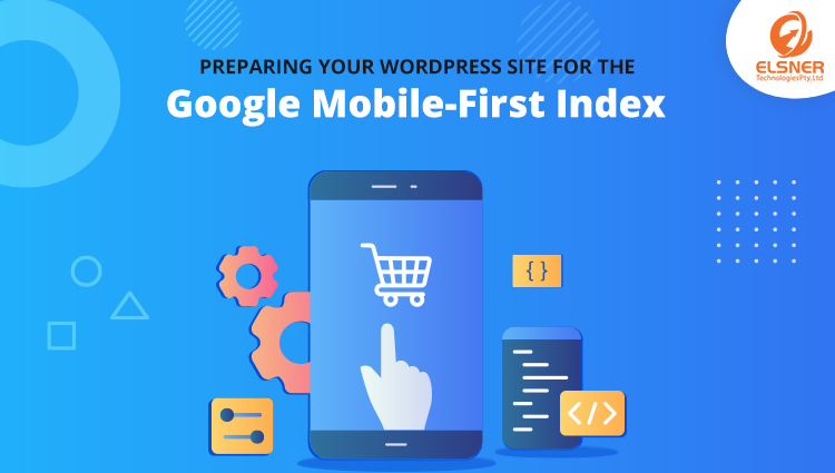
Preparing Your WordPress Site for the Google Mobile-First Index
WordPressThere is a massive growth in the usage of mobile or handheld devices which has made it necessary for the websites to become responsive to stand out. WordPress is a repository for many templates and themes that are responsive and user-friendly across different platforms. You might be planning to hire a WordPress programmer to select the best theme that matches your business requirements and increase customer engagement.
What is a Mobile-First Design?
It is an approach used by modern web designs which first focuses on mobile screens than on other screens, resolutions, and browsers. People are spending more time surfing on the internet for required information and most of them prefer mobile devices. Every WordPress development services will ensure that it is a pixel perfect match with small screens first and then on desktops to boost mobile performance.
The Mobile-First indexing is done by Googlebot which will use the mobile version of the website for deciding the indexing and ranking on the search engines. This helps in improving the search experience for mobile users and gets more traffic on the website.
How to Prepare your WordPress Website for Google Mobile-First Index?
Focus on the Content First
- – Remove extra design elements that are not necessary for content presentation
- – Ensure that content is at the top position on the design canvas as it is displayed on different screen sizes
- – Focus on making the content readable and typography of the content
- – Take help from WordPress developers SEO to decide the color of your text and background to increase visibility
Perform Optimization on Images
- – There are plugins in WordPress that can help in faster loading of images and make them compatible with the selected theme.
- – Images size and quality consume the majority of bandwidth on websites, so you need to optimize them. This can be done by setting smaller dimensions which can be done by many tools available in WordPress like TinyPNG or Optimole.
- – Use fonts that are readable on small and large devices easily. Try using simple fonts as much as possible to make the content user-friendly and compatible with your theme.
Make Every Function on Tap
Most devices support touch interfaces or are entirely based on the touch-screen. That means you need to make each element tappable and accessible for the users. Text links are sometimes not optimized and require a lot of concentration to redirect which can be a negative point for the website. It is better to add buttons on the theme interface which provides a larger touch space and more accessible for the users.
Responsive on different Browsers
The same piece of HTML can behave differently on web browsers which also vary on mobile devices and desktops. It can be optimized by:
- – Testing the website on major browsers makes the troubleshooting process much easier
- – Check the website on multiple devices with different resolution, size, and ratios to understand the responsiveness
Handle the UX Precisely
WordPress developers will advise building a theme that focuses on keeping the specific elements accessible for mobile visitors. You can easily do this by placing the widget area that is displayed on the homepage in the top section which is easily visible to the visitors.
Load Essential Files
Websites today are integrated with modern features to engage more consumers and boost performance. You can check the library or module that is required to execute important functionalities in the user’s browser.
- – Don’t import libraries that are not necessary for the theme’s functionality
- – Try loading HTML structure rather than JavaScript for faster response
- – Load the CSS files and JS for each page individually
Perform Speed Tests at Each Stage
You can install various tools to check the page speed on the local test server for optimizing the theme according to see its performance in real life. There are various tools used for testing like:
- PageSpeed Insights: This is built by Google which gives you data about mobile and desktop performance. It also provides tips to improve the performance of WordPress websites.
- BrowserStack: This gives you access to a different version of popular desktop and mobile browsers. You can see the website on different browsers easily and generate a screenshot for references.
Wrapping It Up!
We have shared some essential tips to prepare your WordPress website for the Google Mobile-First index in the digital world. You are aware of how the world is shifting towards the contact us digital market to fulfill their daily requirements. Some essential tips that are recommended:
- – Add high-quality content on the mobile version which can be displayed through images, text, video, or more.
- – Manage the SEO checklist and update the content regularly as per new guidelines
- – Handle the mobile and desktop URLs separately for website elements
- – Make sure the server hosting site can handle heavy elements and does not affect the website responsiveness.
If your WordPress website is still not on the scale of improvement and you are still figuring out what to focus on first? Hire a WordPress programmer with us today and boost the performance of mobile devices effortlessly. Contact us and get in touch with the provider of WordPress development services in the market.


